I have a list of samples in front of me and I need to decide how to lay them out in my 96-well plate.
The location of these samples matters at the bench, because I need a map for my pipetting. It also matters downstream – when I’m analysing the data coming out the other end, I need to know all the conditions and metadata associated with each well.
Despite the contents of plates being the life-blood of the work of so many scientists, labs, and biotech companies, we still don’t have a good way of creating these maps at the source.
On the one hand, we have sample lists. A table with a column for the coordinates in the plate, and columns for any other metadata that’s relevant – sample IDs, concentrations, volumes. They’re flexible and machine readable. They’re great for data scientists and automation engineers to wrangle into their analysis or development workflows.
However, they’re just a data dump. This makes them painful to interpret and edit as a human. Seeing all of the data all at once makes finding a particular slice of information difficult, and editing error-prone. I can just feel my eyes glaze over looking at a table like this.
Also, the plate is a physical object in the real world. We need a visual to help us think through where things should actually be, as well as follow along while pipetting.
The other side of the coin is plate maps. These are often built in spreadsheets or tables, where each cell represents a single well. You can add sample names to each cell, and perhaps colour code them to visualise another layer of information – to show titration of a reagent, or highlight replicates.
These plate maps are pretty laborious to make, but they do at least visually represent what is in each well.
However, as soon as I have more than one or two layers of information, there’s no way to document that third layer. I’ll have to create another, separate table to capture it. If I want to move samples around, these tables aren’t linked together, so I’ll need to go through every table individually and update the details and the colour coding. Annoying, and more chances to make a mistake. Ugh.
This is clunky, but also from a data processing perspective, translating these maps into something that can be used for analysis is yet another job to do. It depends on how exactly this plate map was constructed in the spreadsheet, what the colour codes mean, where the headers are…
We tried tackling this problem in our most recent update to our experiment builder.
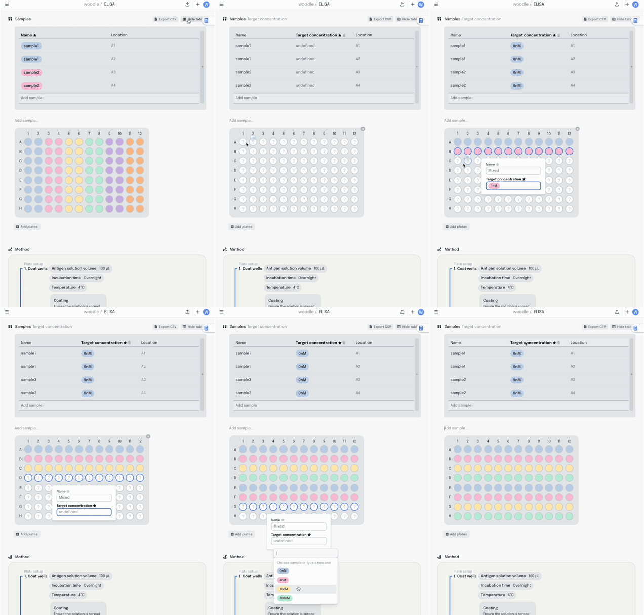
We started with a visual plate mapper. To make a simple, colour coded plate map, just drag over the wells and label them.
This information is synced with a table that summarises the data. Editing the plate map updates the table and vice-versa.
Adding a new column to the table adds another layer of metadata, and I can now add this metadata into the same plate visualisation… where it should be. Here I’m titrating a target concentration down my plate.
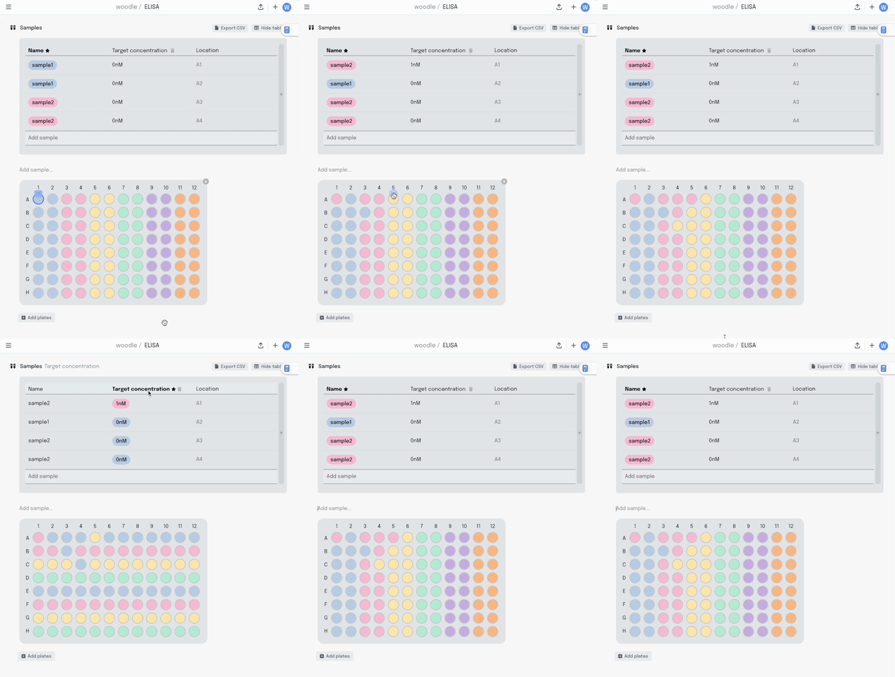
If I make a mistake in my pipetting or just want to move some samples around, I can drag the contents of that well to another position. All that metadata stays linked together.
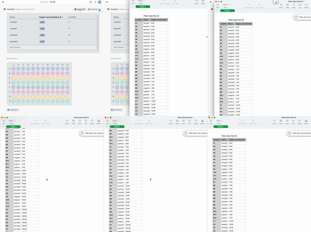
Once the experiment is done and it’s time to analyse the data, it can be exported as a .csv in the sample list format I described earlier.
This feature is now live in our Experiment Builder. If you’d like to try it, sign up! We’d love to hear what you think.
This is our first foray into capturing information in individual experiments. More is coming!


![move-a-sample-spreadsheet.gif [crop output image] move-a-sample-spreadsheet.gif [crop output image]](https://substackcdn.com/image/fetch/$s_!Kcn8!,w_1456,c_limit,f_auto,q_auto:good,fl_lossy/https%3A%2F%2Fsubstack-post-media.s3.amazonaws.com%2Fpublic%2Fimages%2Fc3fa6a82-6f1b-4cd5-9753-9b9cacb27f41_568x405.gif)


